It’s Past Time Your Webinar Landing Pages Got A Makeover
Daniel Waas of GoToWebinar looks at some great and not so great examples of webinar landing pages and provides some hot tips on how to craft a winning one.
Ever caught yourself staring at the before & after picture in a cheap ad?
Trying to pull your eyes away while you chastise yourself for this unsavory attraction to clickbait?
Relax! You’re among friends here. In fact, I invite you to stare at the feeble webinar landing pages below.
If your reaction is like Kristen Bell’s above that just shows your good marketing taste.
Are you ready to revel in a snarky takedown of a bad before picture?
(Brands & names obfuscated to save everyone’s face.)
Let’s do it.
What’s wrong with this one?
I’ll give you a minute to think.
Go on, I’ll still be here in a moment.
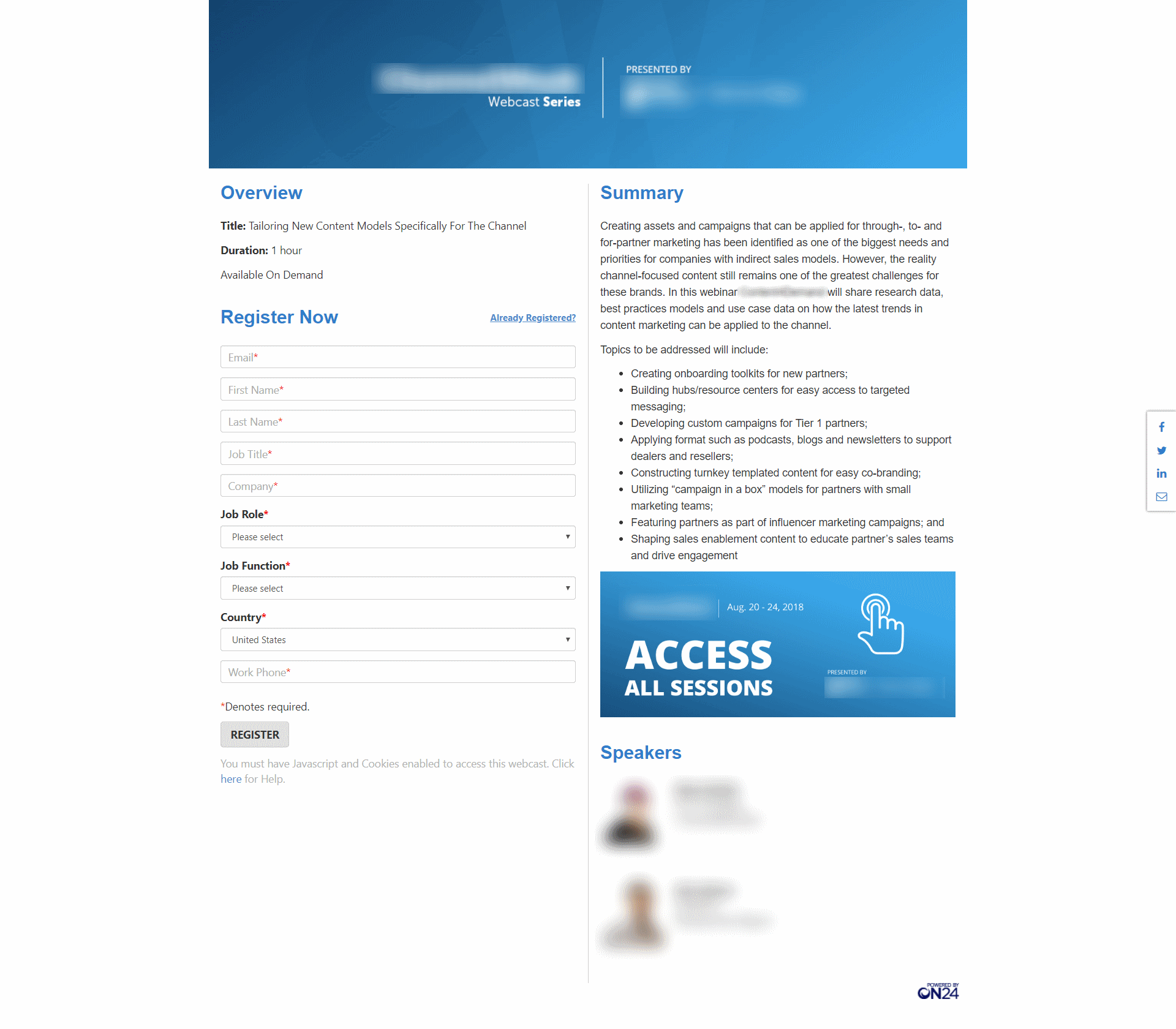
On first glance, did you think “why, it’s not that bad”? Ah, the low standards we have.
The problem
Yes, it’s not as terrible as the typical before picture of an Invisalign ad but here are two major mistakes:
- It’s not immediately clear what the webinar is about. I’m not the first to tell you that attention spans are short. But I do have data that shows great webinar topics can boost attendees by a factor of 12.2x. Only that won’t happen if your reader can’t find the title in the first place.
- The form. Seriously, you need my job title, my job role, & my job function? Isn’t this the same question asked three different ways?
- And you need my business phone number why? So your friendly SDR can blow up my phone?
Oh wait, let me just select Azerbaijan from this endless country drop down. Because I’m sure 90% of your attendees are from outside the US. No, wait, it’s the other way around. Then why bother asking me? Oh, it’s because your routing rule won’t work otherwise. Well, now I understand. Gee.
The fix
Let’s fix number one. This one’s easy. Just take the banner at the top and put the actual title of the webinar on it instead of using it as an ad space.
Number two is a different beast and depends on where you stand in the great gate debate (and that debate is more top-of-mind than ever).
If you have reservations, by the way, I’m with you. I get cold sweats when I think about ungating. And luckily, webinars are a tactic that doesn’t work without at least some form of gating – but you can limit what you ask for.
Name & email can and will suffice.
Want a phone number on top? How about you offer something in exchange? Ask “Would you like a text message reminder before the webinar?” and make the field optional. (Quick tips on how to implement reminder text messages here.)
Going back to “it’s not that bad.” You’re right in a way. We see pages just like this one so often, we’ve accepted them as the norm. Even the big marketing automation & CRM players have landing pages just like the one above, as evidenced by this (anonymous) example:
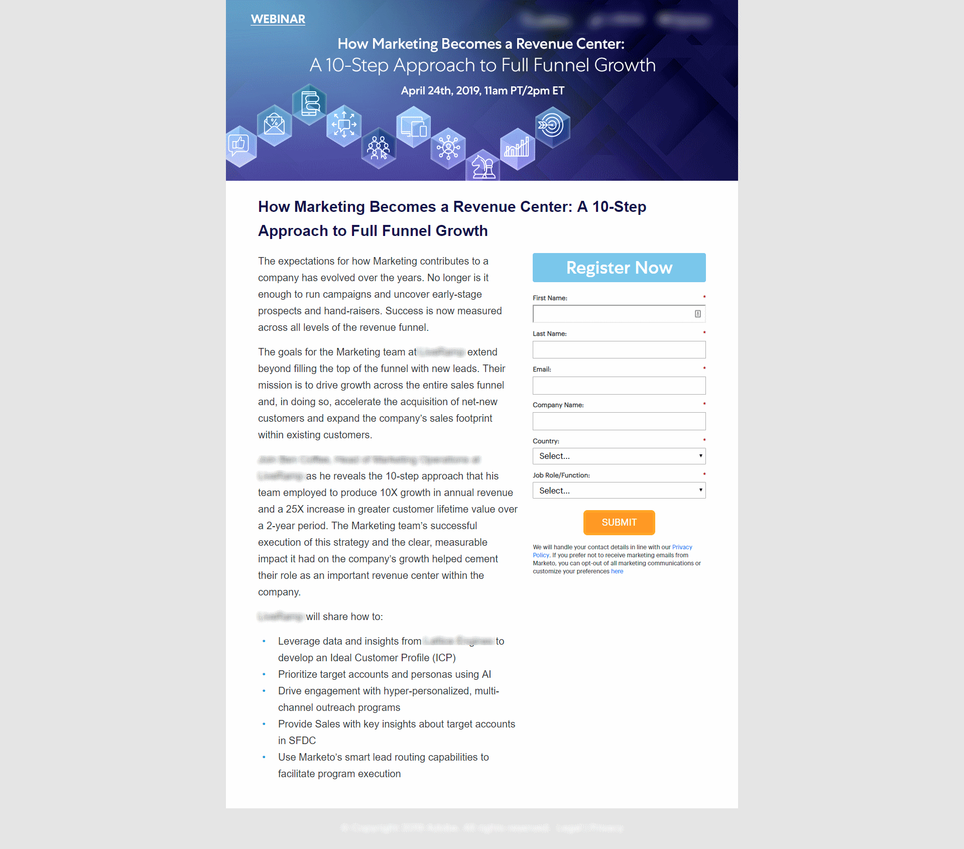
While there’s room for improvement, both examples get some of the basics right.
- Use a simple layout.
A simple two-column layout. Check. - Lead with a bold title.
The first example struggled with this, but the one above gets it right. - Keep the copy short.
The topic sells the webinar so keep your copy short. Three paragraphs are too long. Keep it to 2-3 lines instead. - Clearly state what’s in it for them.
The bullet lists in both cases give me a clear understanding of what I’ll learn. Check. - Highlight the speaker.
Include an image of your speaker and a short bio. Both landing pages undersell their speakers. Don’t just tell me their title. Help me understand who they are and why I should listen to them. - Have an obvious call-to-action.
Both pages have an obvious call-to-action. “Register” might not be very creative & “Submit” is definitely not an ideal choice, but it’s obvious that I have to click the button if I want to be in the webinar.
To infinity & beyond: Giving your webinar landing pages a makeover
Getting the basics right is a pretty low bar. The quality-minded marketer that you are, I’m sure you won’t settle for good enough, right?
Exactly. So let’s take a look at some positive examples:
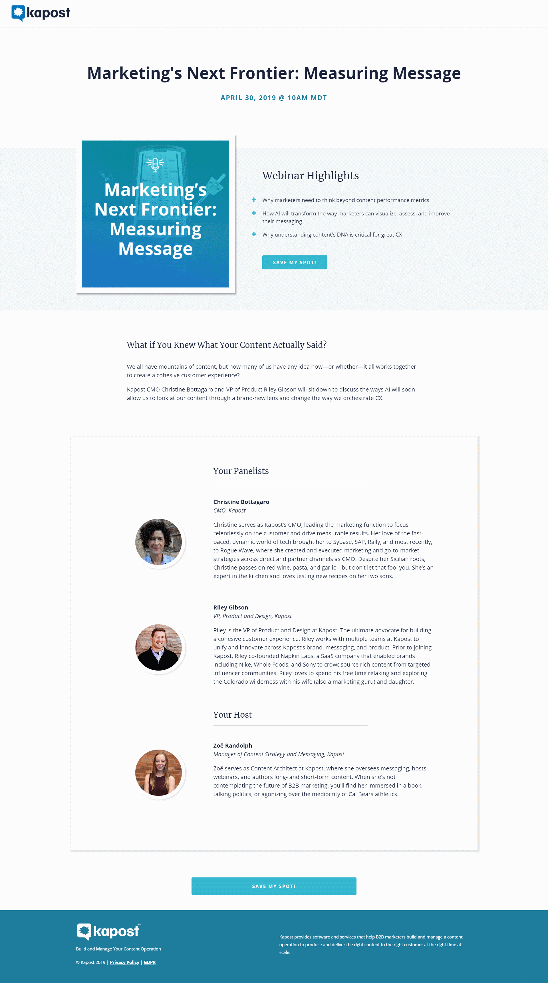
If Kapost were my webinar pupil I’d give them a little star sticker for this landing page 🌟. It nails all the basics and looks nice and clean.
The page sports an obvious title, prominent bullets, a mercifully short description, lots of context on the speakers, and a friendly call-to-action.
The star sticker would have had unicorn sparkles on top (ok, the analogy might not work for everyone, but I have a 4-year-old little girl at home 👨👧🦄) if Kapost had been more courageous and experimental with the form.
I was sneaky and edited it out of the screenshot above to make a point: put your form in a modal. Sort of like this:
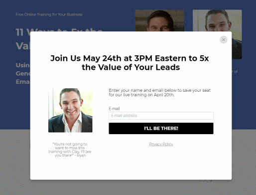
The landing page builder Leadpages has tested this approach and seen an increase in sign-ups. The psychology behind it: our brains hate not finishing something we’ve already started.
By clicking “Save me a seat” we’ve already started the action and are now more likely to finish it. Especially if the next hurdle is low like in the form above with only email being asked for.
As for being courageous: ditching our beloved form fields is hard. You have to take a leap of faith and you may well go cold turkey for a little while after. Hey, B2B marketing friends, let’s leap together & shorten those forms (look at most GoToWebinar forms and you’ll see we don’t always practice what I preach – but we vow to do better 😉
Form fields you should give a cold shoulder to
Take a look at most B2B marketing forms out there. They are often long and cumbersome and full of fields that don’t really need to be there. Here are the fields I believe we should all give the cold shoulder to:
- Country & company name. Think we should omit them. Yes, it’ll be harder to score and route the leads but you can always capture these later or try to append them. Country and company especially have a relatively high match rate based on IP address with services like Demandbase or Clearbit.
- Title and department. Again, with reliable third-party sources, consider dropping them and appending that data instead.
- The question for Business Type and Marketing Automation I find valid. Questions specific to your sales process are more difficult to get from other sources. But consider asking them as an in-session poll instead to reduce the barrier to sign-up.
Let’s see one more example.
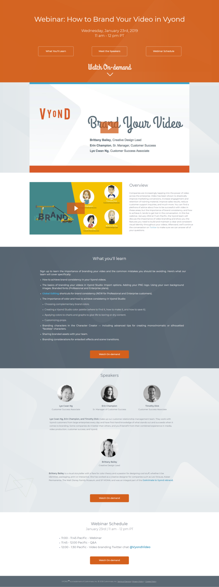
Increasing Webinar Sign-Ups with Video Teasers
This example is from video software company Vyond. The page is very much on the long side, but what it gets 100% right is the use of video on the landing page itself.
Full disclosure: With my team at GoToWebinar, I co-hosted a session with Vyond. We wanted to test the impact of a video teaser on webinar registration rates.
We found that a short teaser video promoting the webinar in both the email invite and on the registration page increased sign-ups by 43.8%.
Making every webinar a part of your buyer’s content journey
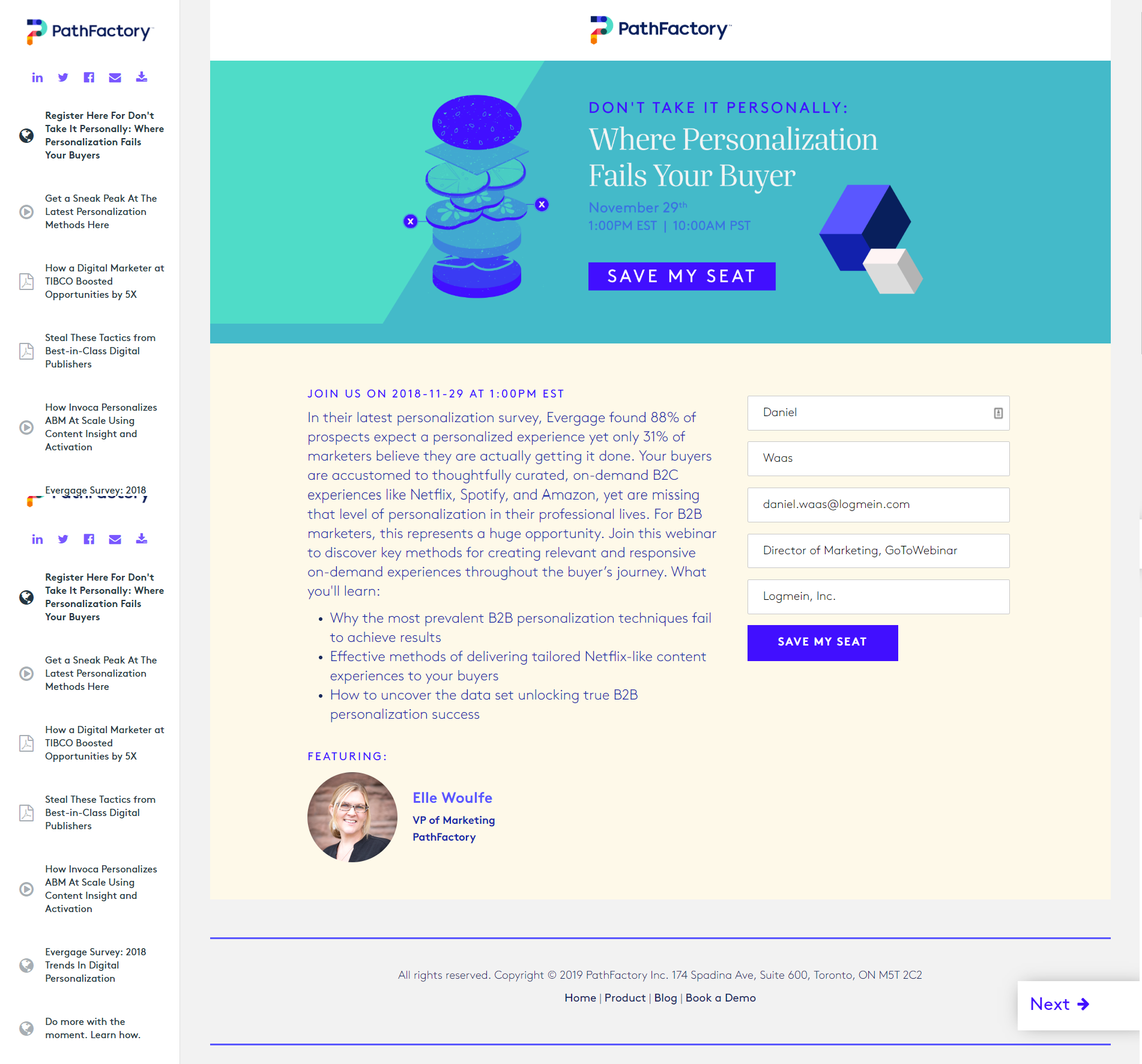
The next example is part of the reason I wanted to write this guest post. I’ve been on PathFactory’s mailing list for a while and their webinar invites are unique in one major way.
Consider the page below. Elle’s team checks all the boxes in the best practice list I outlined above (including the short form). Not only that but the consistent illustration style adds a great deal of personality.
That’s all good. What’s great though is how the webinar landing page turns from a dead end into a step on a potential content binge.
When customers hit your webinar page they’re still days or weeks away from the date of the event. On the “Thank you” page you need to confirm they’re registered and ideally prompt them to add the event to their calendar. For your visitor, there’s nothing else to do and that’s usually where their journey ends until the join the webinar.
What’s unique about PathFactory is that they show a number of related assets that invite the registrant to stick around and discover other content relevant to their current interest.
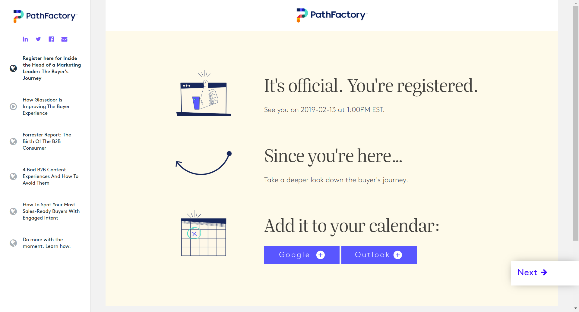
A neat way to turn a dead end into the start of a relationship. One you can continue to deepen through personal engagement once on the webinar.
The takeaway
Webinars make for great gated offers and are the perfect addition to a content strategy heavy on ungated content.
So go and give your next webinar landing page some 💕.
(Here are a few more great examples for inspiration.)
What’s your take on how to use webinars as part of your content strategy? And how do you deal with gating? Let me know in the comments below.